THE IDENTITYGush was created to spark the joy of living, to throw perfection out the window and create a visual system that makes its own rules.
A clean beauty brand inspired by the generation it was made for. A brand that emphasises beauty without standards & make-up without routine.
So when it came to this project, we decided to colour first and then draw the lines outside.
Gush: The Power of Joy
Role: Brand Identity, Creative Direction, Packaging, Social Media, Website
Studio: AGENC, New Delhi
Team: Anuradha Thirani, Karan Singh, Richa Sinha, Shreya Jain


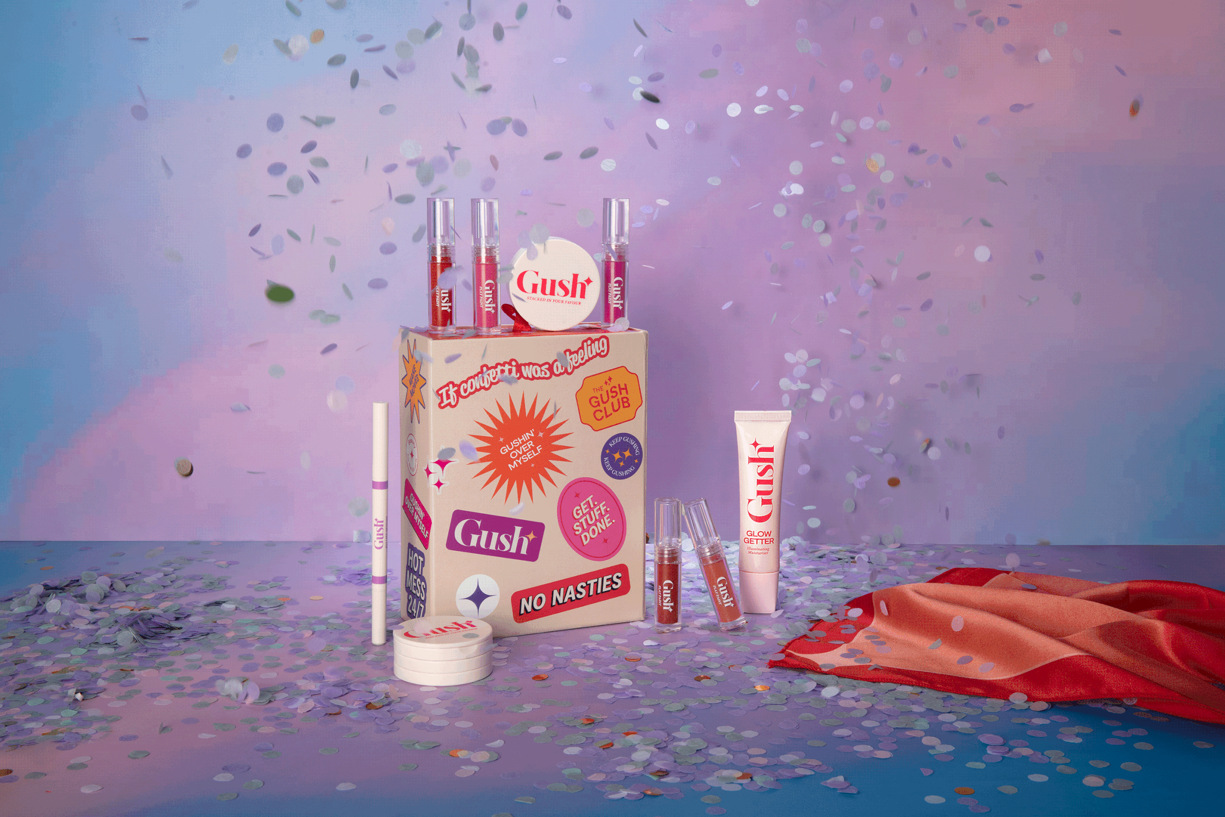
SEED THOUGHTGush is all about being bold, young, and fun. We played with splashes of bright colours and pastels.
We wanted the visuals to bring that pop of life, to make it boisterous - where every interaction with the brand would excite and surprise the consumer, every purchase would make them gush.
Think Confetti.
But a feeling.


BRAND TONEGush has a dynamic colour palette with bright colours paired with pastels and neutrals which would contrast, compliment, and most of all bring that exuberance in the visual system.
The brand-mark of Gush is the North star. It symbolises the brand's core value - it wants you to shine your brightest.
Vivid fluidic art aesthetic inspired textures were created to be used on retail packaging.
Fun. Friendly.
Always Real.


